I love comparing covers and judging books by their covers! We all do it and it's fun to analyze what works and what doesn't. Here are some recent cover changes I've come across:
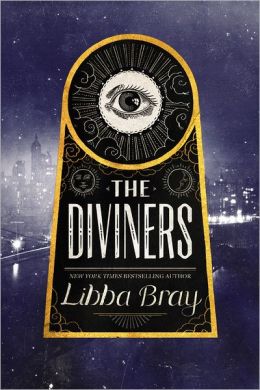
Hardcover:
I love the color and the eye on the cover just feels like this is going to be something spooky and mysterious.
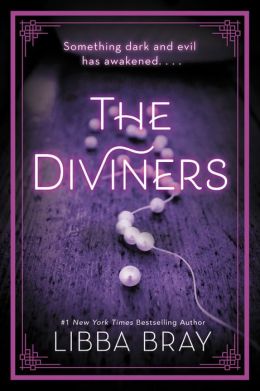
Paperback:
I still like the color, but I'm not sure about the rest of the cover and I'm not sure why. I do like how this cover gives more of a feel of the 1920s, but I think the spookiness is missing.
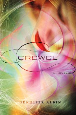
Hardcover:
I think this one is pretty, but nothing special. It wouldn't catch my eye.
Paperback:
-I like how this one has a more futuristic feel, which I find appealing. It also feels a bit science fiction like and for some reason makes me think of Star Trek (which has nothing to do with the book and it's nothing like Star Trek) but it would make it pick it up.
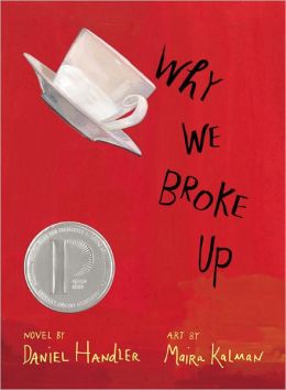
Hardover:
-This one is simple which I think makes it stand out.
Paperback:
-Again the simplicity of the cover works for me, although this cover makes me think it's a fairy tale retelling.
Hardcover:
-I think this one is nicely mysterious if a bit plain.
Paperback:
-This one is a miss for me. It now looks like a poorly made self published cover that was thrown together and instead of looking like a mystery it looks like a sad, depressing book.
What do you think of these changes? Any others you've noticed recently?

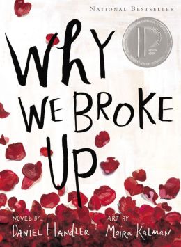
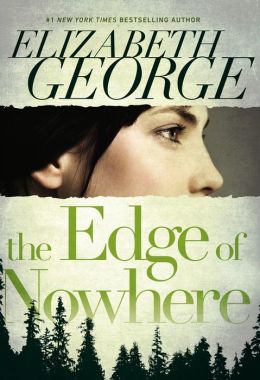
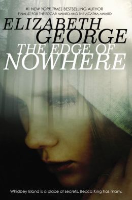
I prefer the original cover for The Diviners. I think the new cover looks like historical fiction but maybe teens will like it more.I prefer the original cover for Why We Broke Up too.
ReplyDeleteI do like the new cover for Crewel. It definitely makes the book look more interesting.
HATE the new cover for The Diviners! Yuck!
ReplyDeleteLOVE the new cover for Why We Broke Up.
And honestly I don't like either cover for Crewel.