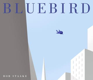
My library is hosting our second annual Mock Caldecott this month, so I'm sharing my thoughts on the list I put together (we have ten titles we're discussing). Do you think any of these books have a chance at winning a Caldecott in 2014?
-2013 was quite an interesting year when it came to wordless picture books. Bluebird is one of the standout ones in my opinion. When I first read it earlier in the year, I thought for sure this one was a lock for Caldecott, but going back to it time and again (and committee work is all about re-reading and analyzing!) I'm not so sure about it's chances. I wonder if the graphic design to the book is distinguished enough-the more I read it, the more it looks like graphic design and I feel like the flow of the design isn't there. It feels too produced illustration wise. I like the varying shades of blue throughout, but I also see this as a flaw, because I don't know that it ever really adds anything to the story. Even in the end when we see the other colors of the birds, the addition of more color looses some of it's power because it's so small. And the story is just so darn depressing-not a committee consideration at all, but something I notice each time I read it! I also think it has trouble working as a wordless picture book because the story isn't always clear. This one has waned for me over time and while I still think it's a strong contender, I'm not sure it's one of my top picks.
-There's something about debuts and committees that always seem to go hand in hand. Maybe it's the thrill of discovering a new talent and sharing it with the world? Maybe it's the joy of honoring something new in the field? Being a debut isn't a shoe-in to win an award, but I think if any debut picture book has a lock on an award this year, it's Aaron Becker's Journey. For me, this is the book to beat. It's another wordless picture book that does an excellent at telling a wordless story. The reader knows exactly what is happening and while there is some magic that the reader has to fill in, it all flows nicely and makes sense. There are pages in this book that are beautiful and breathtaking and the type of full page illustrations I want to pour over and have hanging as a poster in my office. It's simple yet complicated which is what I think makes it stand out. The illustrations look simplistic enough at first glance, but the more you analyze them and look them over, the more detail you start to see. There's a nice blend of colors and style-some of the illustrations really stand out (the castle) and others are more muted and quite (the forest). I also love the slow, sly introduction of color throughout and how the girl's journey starts out in a sepia tone and becomes full color as her imagination takes off-another great layer added to the story. I think Journey is my top pick and I would love to see it honored this year!


Comments
Post a Comment
I love hearing from other readers! Share your thoughts and chime in!